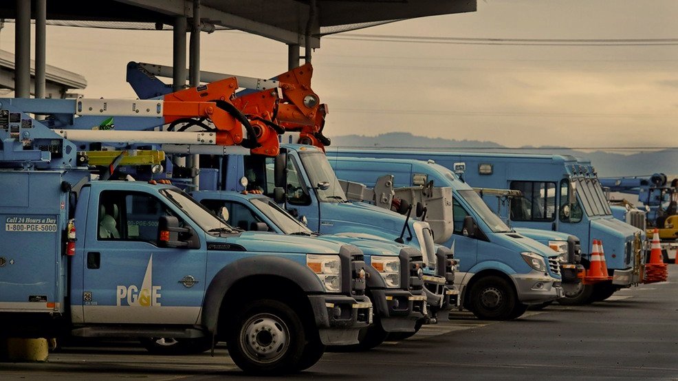
PG&E Emergency Web Redesign
This case study covers a six-month project to redesign PG&E’s “emergency web”, which hosts outage and safety shutoff information. Both desktop and mobile were designed. The goal of the redesign was to make it easier and faster for users to find public safety power shutoff (PSPS) event information, as well as update the UI.
the basics
How long was this project? 6 months
When was this project completed? February - August 2022
Pacific Gas and Electric Company (PG&E), incorporated in California in 1905, is one of the largest combined natural gas and electric energy companies in the United States.
PG&E originally set up the emergency web as a response to a website crash during the 2020 wildfire season. Millions of people were without access to outage and public safety power shutoff (PSPS) information. Months before this, the California Public Utilities Commission (CPUC) began oversight over PG&E in response to numerous safety instances and a bankruptcy filing. The CPUC wanted the emergency web up ASAP as a backup website for the main PG&E website, as well as a spot for federal partners. Because of this, it was developed with little regard for user experience.
What is a public safety power shutoff event?
High winds can bring tree branches and debris into contact with energized lines, damage equipment, and ignite a wildfire. As a result, we may need to turn off the power during severe weather to help prevent wildfires. This is called a Public Safety Power Shutoff (PSPS) event.
what’s the ask?
While PG&E has dedicated some time since 2020 to improving the user experience on the emergency web, there has been no organized effort. In 2022, they got preliminary approval to enhance the emergency web and their outage center.
The ask from PG&E was to make it faster and simpler for customers to find out PSPS information as well as support and resources while keeping bandwidth low and information required by the government easy to find and understand. Both the desktop and mobile versions of the website were to be redesigned.
my role
UX Designer
As the only UX designer on the project, I was responsible for all ideation, user flows, wire-framing, prototyping, and UI changes. User research was conducted by the PG&E team, though I was able to observe the testing. I worked with the agile lead, product manager, and lead developer daily to ensure that we were meeting our goals and keeping the client happy.
meet the team
UX DESIGNER
Brooke Lytle
AGILE LEAD
Neil Hibbert
PRODUCT OWNER
Michelle Thomas
LEAD DEVELOPER
Ella Wismer
DEVELOPMENT TEAM
10+ developers
QA TEAM
10+ QA testers
project constraints
federal oversight
Since 2020, the California government has been overseeing PG&E in all of its operations. Because of this, the team had to follow strict requirements when completing our redesign: information they deemed the most important had to be front and center, all copy and photos had to be meticulously edited and certain statistics and resources had to be visible, although research had shown regular PG&E customers were not interested in them.
lack of access to users
PG&E was very particular when it came to dealing with their users, and they didn’t allow contractors to speak to them directly. I was unable to conduct user interviews or user testing, and had to rely solely on the emergency web team to get a clear understanding of the users I was designing for.
a big pivot
In the middle of the project, we learned about budgetary restraints that completely updated the scope of the project. At the beginning of the project, we were working towards combining the emergency web with the outage center, with the intention of emergency web being a “backup” of the outage center. This was based on preliminary funding approval from PG&E. Halfway through, we learned only a portion of our budget had been approved. The project had to be scoped down considerably from a large undertaking of combining the outage center with emergency web to only being able to update pages that directly related to public safety power shutoff events or federal requirements.
technical constraints
Since emergency web was originally created to host user traffic if the main PG&E website failed, there was a number of constraints I had to adhere to while designing. No redesign could sacrifice load speed to any extent, and I was unable to add additional content or pages to the website as it would effect bandwidth. The more content on the website, the more expensive emergency web was maintain. Almost all articles had to link out to the main PG&E website, except those deemed critical for users in the case of an emergency.
my design process
understanding
My first task was to take a deep dive into the current user experience of the emergency web. I completed a detailed analysis of the PG&E website and noted down any big problem areas I saw. With the PG&E team only asking for an improvement in the user experience, that left a world of possibility.
Almost immediately, I learned that the website was riddled with inconsistencies. I reached out to my project lead and discovered that a UX designer had only ever consulted on the emergency web project, and front-end designers were left to design components and pages however they liked. A design system did not exist, and the emergency web was not following the styling guidelines of the regular PG&E website. I made a mental note to create a design system or detailed style guide for developers to use so that the users’ experience on the emergency web was consistent and positive.
To wrap up my research of the current website, I looked into how easy or difficult it was to complete certain tasks. This research helped me narrow down what spots needed to most work, and which I could mostly leave alone. While I did request to be able to set up interviews with real PG&E customers, my request was denied. In order to bypass this issue, I worked with coworkers unfamiliar with the website to gauge first reactions and concerns.
The main problems I found were:
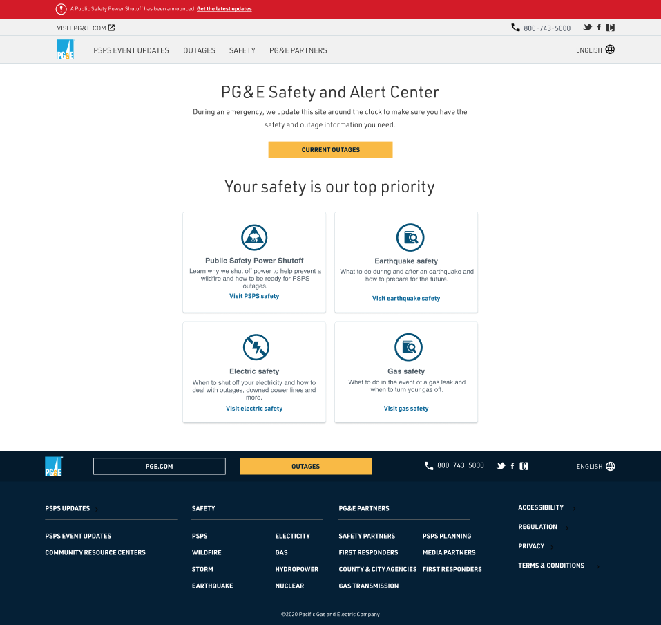
The home page was confusing and did not explain the purpose of the website
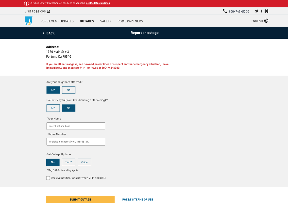
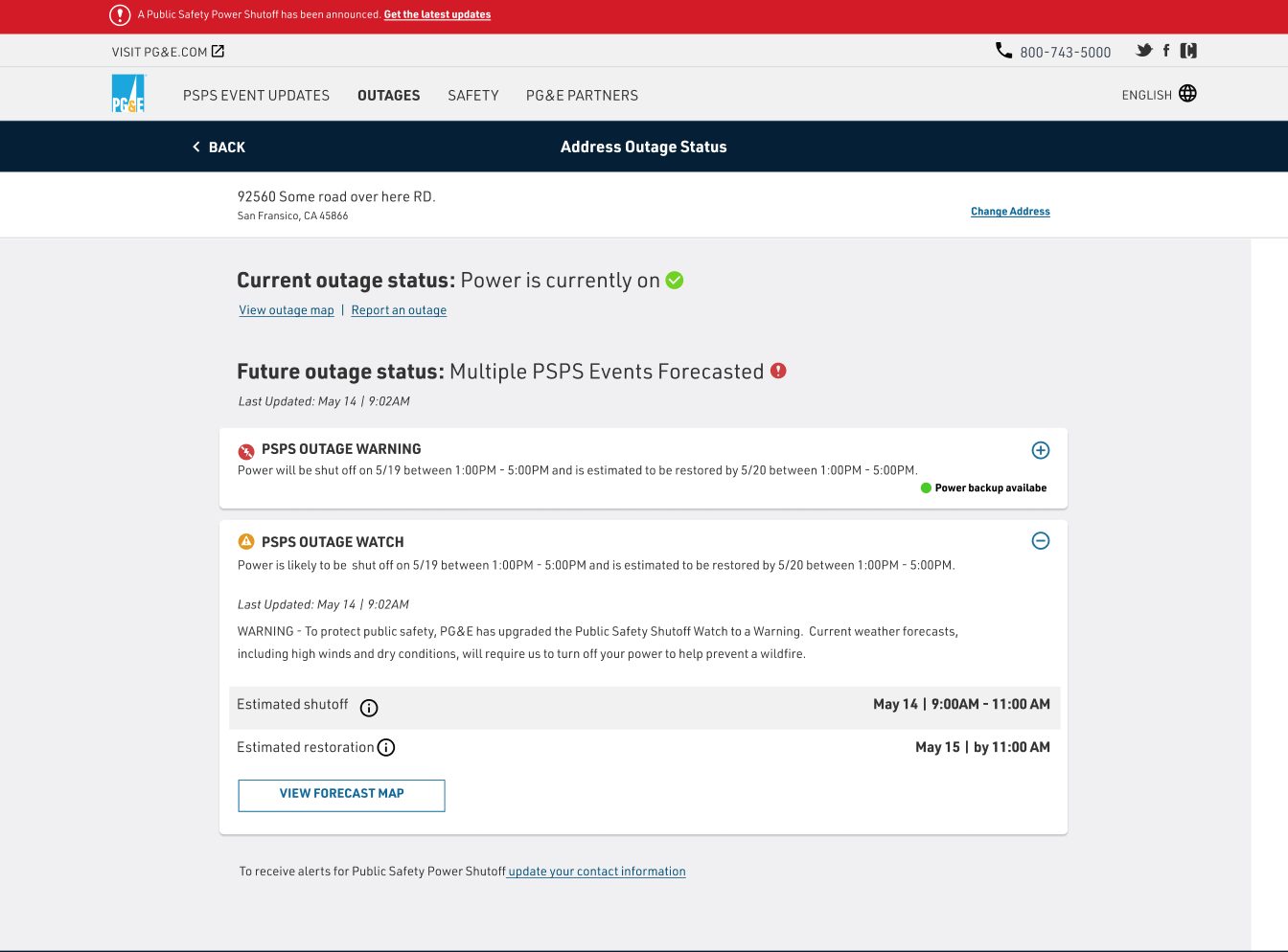
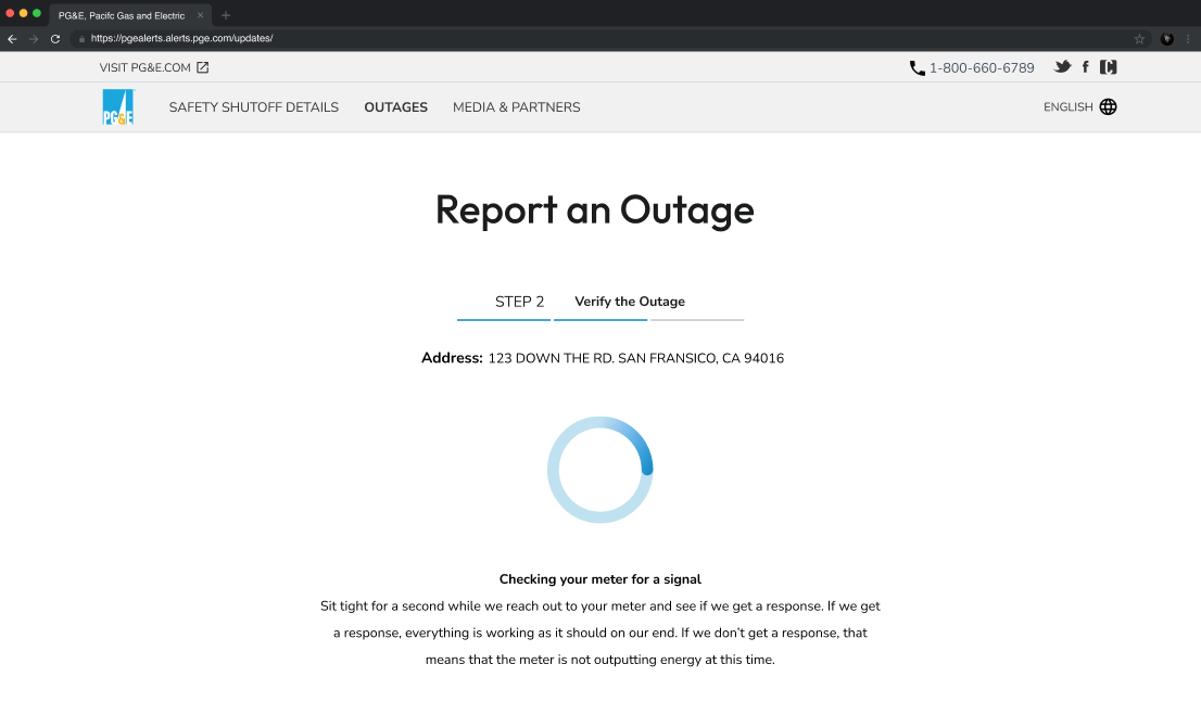
The ‘report an outage’ process was extremely difficult - a user could go through all the steps to report an outage, but couldn’t actually report one. In the end, they were just given a phone number, which was incredibly frustrating.
The page where users could sign up for notifications was confusing and hard to follow.
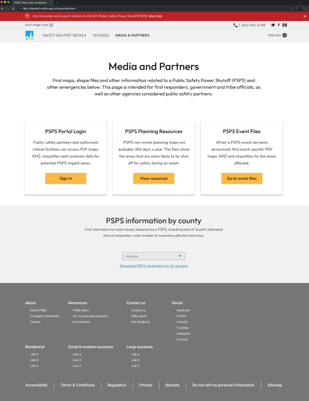
The PG&E partners page held a lot of good, relevant information, but that information was buried behind information required by the federal government (but not used).
The navigation did not lead users to the pages they were expecting, making it difficult to find relevant information.
Understanding the current website
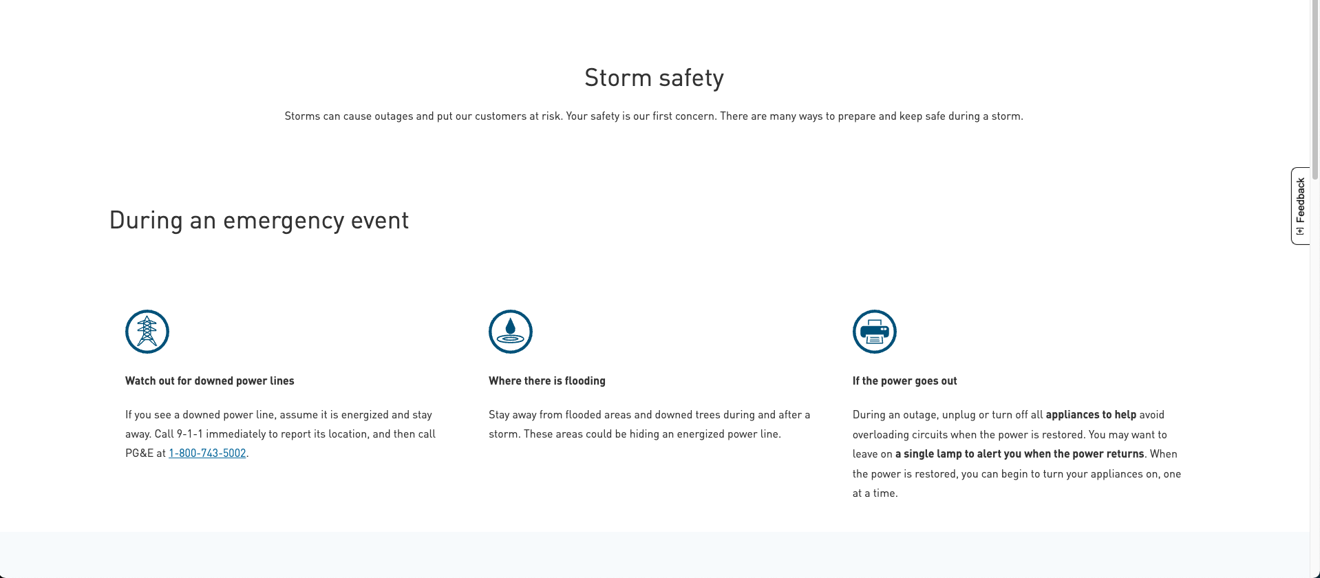
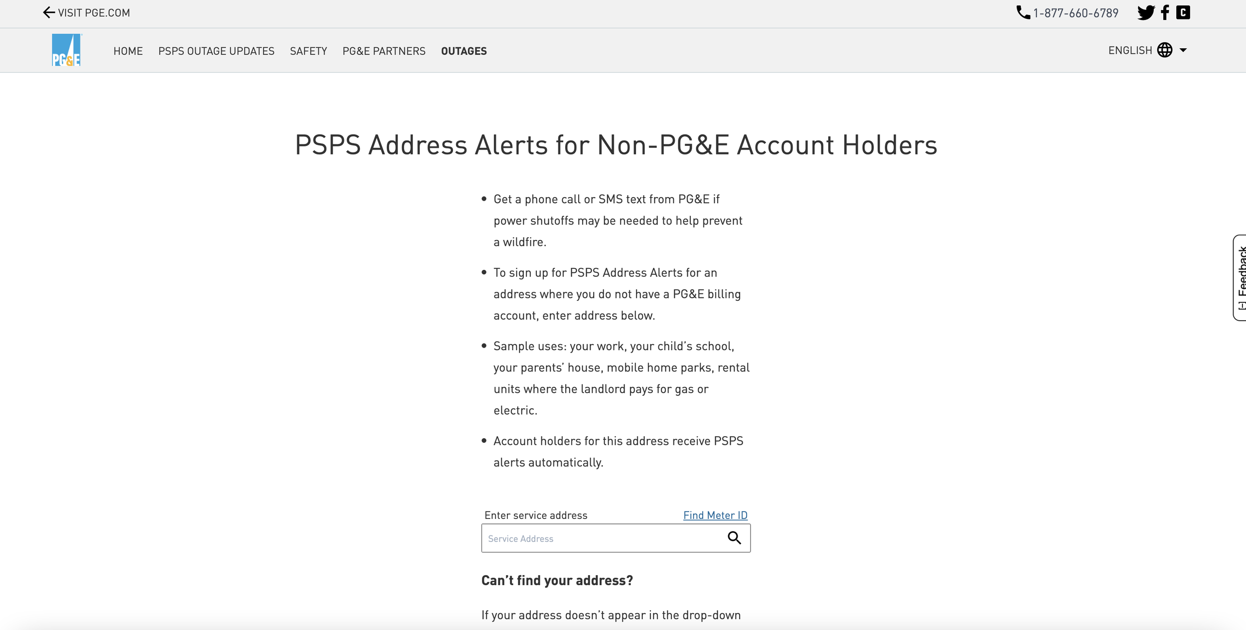
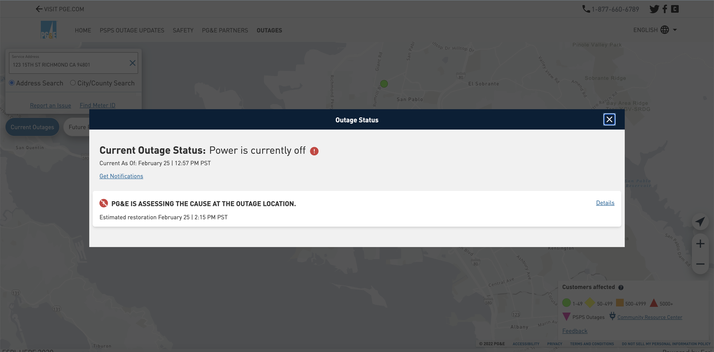
Emergency Web before the redesign
User Persona Development
Quickly after investing how the emergency web currently worked, I realized that user personas for emergency web did not exist. In order to properly determine how to give the best user experience, I needed to know who my users were. Again, I was unable to talk to live PG&E customers, as PG&E was very strict about their user testing policy. To overcome this, I spent time with the emergency web team learning about their customers, who they were catering to, and their wants and needs. They were able to point me in the direction of the user personas for the standard PG&E website, which was incredibly insightful to help me develop mine.
I came up with three distinct user personas - each with their own reason for using the emergency web, pain points, and way of accessing the website.
PERSONA 1: Federal Oversight
A massive concern for the emergency web team was making sure that they were following federal regulations, no matter if they were difficult to achieve. In order to make sure that we were meeting their expectations, federal oversight was a top persona.
Stacey works for the California Public Utilities Commission, which oversees PG&E. Her main goals are to minimize the impact of PSPS events, make customers aware of their resources and rights, and keep the lights on as often as possible.
PERSONA 2: High-risk customers
Next up were PG&E customers that relied on electricity more than the average person - those with disabilities or relied on electricity for medical devices. For these people, losing electricity for long periods of time could literally be life or death.
Andrew is a middle-aged accountant that uses medical devices for his disability and needs access to power 24/7. Because of this, he needs to know earlier than most people when, and for how, the power will be out so that he can prepare accordingly.
PERSONA 3: The average California customer
Lastly, the average PG&E consumer had to be accounted for. Everyone deserves to know when, why, and for how long their power will be out - especially since they are paying for it!
Kyle is a young software developer who works from home. He requires power in order to work, and heavily relies on his devices to keep in touch with family and friends. Power outages can be frustrating for him, as he has to go out of his way to accommodate anytime the power is out at his apartment complex.
Competitor Research
As part of my goal to understand the best way to redesign the user experience of the PG&E emergency web, I had to see what their competitors were doing. I looked at various competitors and compared how they handled both regular outages and PSPS events. This gave me a better idea of what users expected to see.
Takeaways from competitor research:
All other utility providers combined PSPS events with their outage information
The outage centers were part of the main website, not a separate website
No other entities had federal oversight as pervasive as PG&E
Most competitors had a section showing the current situation - how many people had power, how many people did, and more.
Two examples of competitor websites, DTE & Consumer Energy
defining the problem
Finding information was difficult, and the user experience was unappealing and inconsistent.
PG&E’s emergency web was scattered and lacked a clear vision. Not only did users struggle to locate information, but so did the internal teams working on the website. Information was difficult to find and was not visually appealing. Resources were buried throughout the website, and there was no clear path for users to take to learn about resources in their area, sign up for notifications, report outages, or even get up-to-date outage updates about their own residence.
the pitch
In order to solve the emergency web’s plethora of problems, we needed a big solution. After collaborating with the product owner on everything I had found, we came up with a solution to pitch to the client:
A brand new outage center that combined the current outage center and emergency web. Users would be directed to the outage center for all outage information and updates, and the “true” emergency website would be a carbon copy of the outage center, but would only be used if the main PG&E website and outage center crashed, limiting the number of users emergency web got on a daily basis and lowering the operational cost.
The PG&E emergency web team loved the idea and told us to move forward on it immediately, as fire season was coming quickly, and all changes needed to be live before then.
Ideation
Using Fjord’s design vision as a base for UI design
Before the beginning of this project, Accenture’s Fjord had won the contract of a complete UI redesign of the regular PG&E website. While this UI redesign project would take years until it came into fruition, I was required to base my designs off Fjord’s UI vision, which was still very much in the beginning stages and was consistently evolving. I was given their pitch deck and a link to their exploration Figma file that they had used.
examples of the design vision from Fjord
One page at a time
To make sure we were staying on schedule, the product owner and I decided on a prioritization list of pages to work on:
Navigation
Home page
Reporting an outage
PSPS updates page
PSPS Partners page
Address Lookup
Safety Pages
Address map
Navigation and the home page were chosen as the top priorities due to the bulk amount of users seeing each - and both being integral to a user being able to find the information they are looking for.
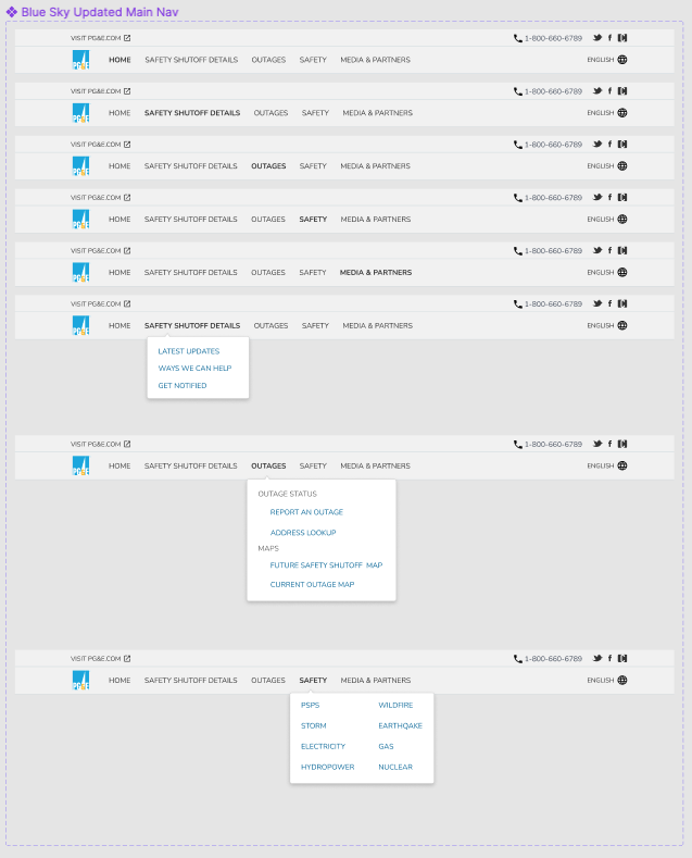
Navigation ideation
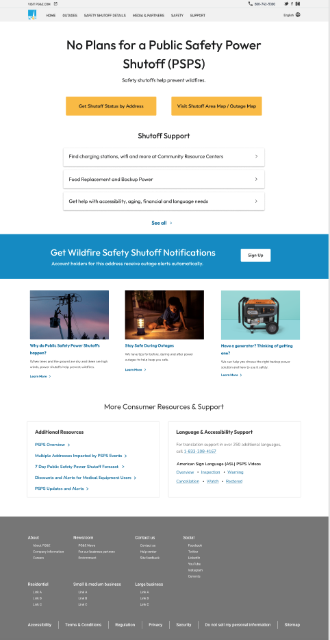
Home page ideation
low fidelity wireframing example
high fidelity examples - not selected
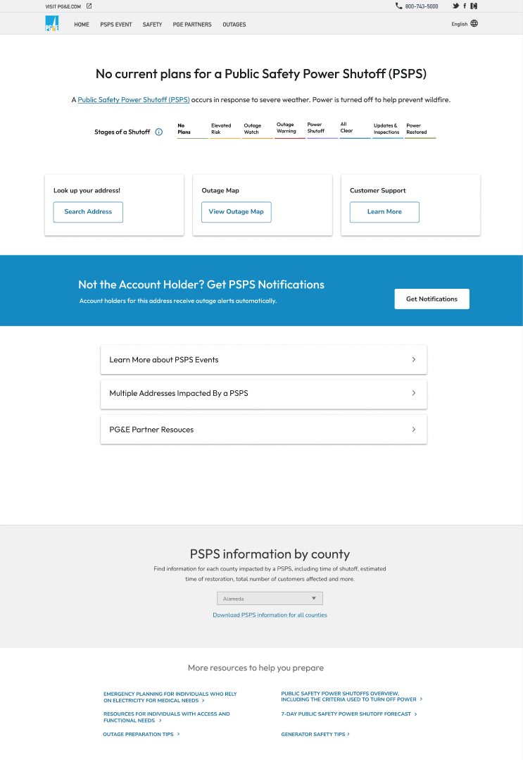
principal design selected
(both desktop and mobile displayed here)
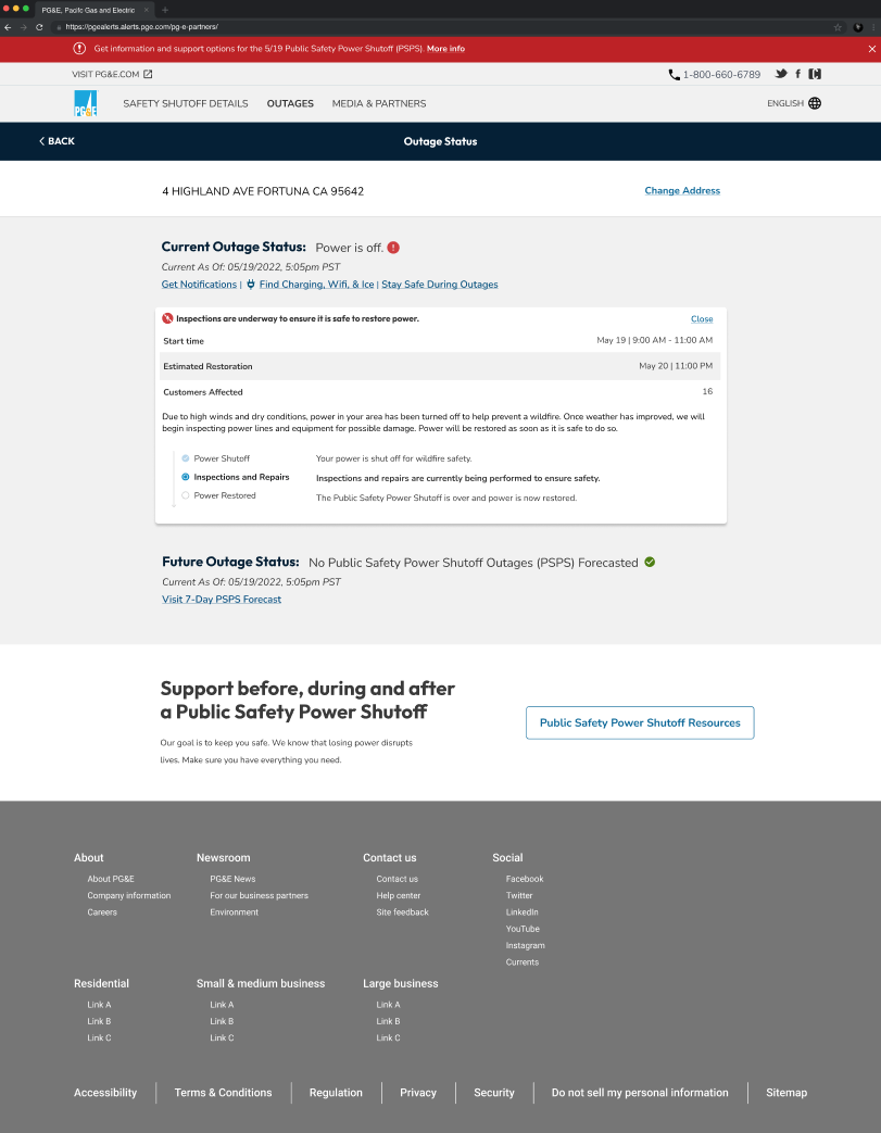
PSPS Updates ideation
PG&E Partners Ideation
the big pivot
Around halfway through the project, we learned only a portion of our budget had been approved. Because of this, the project had to be scoped down considerably. This meant no combining of the emergency web with the outage center, and many larger changes had to be scaled down.
The new scope:
Navigation - updates allowed to continue as planned
Home page - this page was completely cut out, as it did not pertain directly to PSPS events
Reporting an outage - minor UI updates could be made
PSPS updates page - updates allowed to continue as planned
PSPS Partners page - updates allowed to continue as planned
Address lookup - minor UI updates could be made
Safety Pages - minor UI updates could be made
Address map - no updates allowed
To adjust for the new scope, multiple changes were made to each page where ideation had already begun. One of the biggest changes was the removal of the home page, which was an integral part of our original pitch. To accommodate for what we were losing, we redesigned the PSPS updates page to function as a pseudo-home page. While we were not allowed to touch the current home page available, we did make the change to route users from the main PGE website directly to the PSPS updates instead of the home page. The only way a user would now access the “home” page would be through typing the website address in directly or clicking on the PGE logo.
We also fought for some smaller user experience changes on pages that only UI updates could be made. While we did not win each battle, we were able to improve the experience of reporting an outage by more clearly letting the user know what was going on. We were also able to make changes to the address lookup, mostly by making it cleaner, simplifying the experience, and more legible on mobile devices.
The winning designs


