Salubri Mobile App
“A revolutionary new way to track and improve your health.”
This case study goes through the entire user experience design process from start to finish. The task was to improve a user experience of any kind, as long as it was digital. I chose to create a mobile application from scratch that was related to a business concept developed in college. I worked on this project entirely independently.
Product featured in this case study:
Salubri - a mobile application that tracks your supplement usage and determines which supplements are working in favor and which ones are not.

Project Overview
Problem - Target Audience - Business Challenge
The Problem
The beginning of this mobile application case study came from the fact that I had been a supplement user for many years. After going to an integrative doctor, I was given a course of supplements to take and a small explanation of why. Years later, I was still attempting to work from that beginning list of supplements to determine what supplements worked best for me. I had tried numerous brands, types of supplements, and different price points, but I still was unable to successfully determine which supplements were actually making me feel better, and which ones were no longer needed.
To begin, I came up with a problem statement and followed up with interviews with my target audience.
The health-conscious person needs help determining if their supplements are working so that they can achieve their health goals.
The Target Audience
Health-conscious supplement users.
Business Challenge
Determining a way to provide frustrated supplements users with an application that would educate them on supplement use, give them insight into how a supplement should be working (or shouldn't be). Users were extremely limited in their knowledge of supplements. This application would give them a chance to take ownership over their supplement journey while also pairing supplement brands to potential users.

Understanding the Users
Empathize & Define
Interviews
During the discovery phase of my project, I conducted user interviews in order to get a better understanding of the problem. In-person qualitative interviews with a set of base questions were used to determine the target audience's wants and needs in a product.
Four interviews were conducted with supplement users of various age ranges and differing amounts of supplement usage (ranging from occasional to avid use).
Some research questions included:
What supplements do you take? Why? Do you think they are working?
What system do you currently have in place for tracking symptoms or progress? If you have no system, why is that?
Walk me through the last supplement you stopped taking and why.
Does your doctor currently regulate your use of supplements? If not, do you?
What is the most frustrating thing about your experience with supplements?
Affinity Mapping
Some key insights from my interviews:
No users tracked if a supplement was working, but they all wanted to know.
No users worked with their doctor to track the use of supplements. Most preferred to track usage themselves.
Only health-conscious, consistent supplement takers were interested in putting in the effort to track their supplement use and side effects.
User Persona
When deciding between a customer journey and personas, I felt developing a persona was more beneficial, as this application was being designed from scratch versus being improved. A clear picture of the user was required in order to determine the features most needed in the application.
The persona was developed through a mix of user research and perceived stakeholder requirements, with integrative practices and supplement brands as stakeholders. It featured a summary of the main user, a biography, a scenario, behaviors as well as needs, goals, and frustrations.
Throughout the entire design process moving forward, I reflected on the persona to make sure I was addressing her needs, solving her frustrations, and helping her achieve her goals.

Beginning the Design
Ideate

Sketches
I like to start the design process with sketches of low-fidelity wireframes. The main goals of sketching were brainstorming and determining a starting point for creating wireframes. I sketched out my original ideas and then continued to try and draw different versions of each concept.
My knowledge about my users and their goals influenced my sketches in a number of ways:
how I would craft the experience
what problems I would solve and what goals I would achieve
how to make the application compliment the behaviors and preferences of the user versus hinder them
The sketch layouts I chose to move forward with featured five different screens - a home screen, a diary, a "progress" screen, a profile, and a search page. All could be accessed through the bottom navigation bar. The sketches focused on simple graphics and leading headers.
Once choosing sketches, I created a user flow for each basic feature. These sketches and user flows helped lay the foundation for my first iteration of low-fidelity wireframes.

User Flows
User Flows were created for the following three main functions of the mobile application I chose to pursue based on user research, as well as logging in and onboarding.
Journal Feature - adding an entry to your daily tracker as well as viewing older entries.
Supplement Status & Progress - viewing your status or progress of a particular supplement
Search and Profile - adding a supplement to your profile

Wireframes & User Testing
Prototype & Test
Low Fidelity Wireframes
At the beginning of my design process, I created low-fidelity wireframes for testing purposes. This was done using Figma. This was the first step in taking my ideas and sketches and constructing a mobile application.
User Testing - Round 1
After creating my first iteration of low-fidelity wireframes, I collected basic qualitative user feedback. Independently, five users were given a broad description of what the app was supposed to accomplish. They then got to run through a basic Figma prototype of the wireframes. The goal was to see if they could determine what each feature was and if they believed it was useful or not. After this round, I went through and made a few updates to my wireframes. The users were able to determine basic features such as the search feature, the diary. While they recognized the profile feature and the progress page, they were confused about the content available and how it would be beneficial. This lead to a redesign of the profile feature and updates to the progress feature as well.
Mid-Fidelity Wireframes
User Testing - Round 2
The second round of user testing focused on quantitative data. Two tasks were set up for users to complete on Maze.co, which is a remote testing platform. The test subjects were collected from my General Assembly course, and about one-third of the testers met the target group. The main goal of this testing was to see if the application features were simple to understand and if a user could achieve a basic goal.
Test 1 - Adding a supplement to your profile (18 testers)
Results: 83.4% success rate; 8.4% misclick rate; 2.5 sec duration
Test 2 - Checking on your progress of a particular supplement (9 testers)
Results: 33.3% success rate; 3.7% misclick rate; 3 sec duration
Some key insights from this testing were the following:
People continued to struggle to recognize the progress page and were unsure of what constituted the status for a supplement
Users were unsure where the bottom home screen icons led to
People took more indirect paths versus direct paths
The following changes were made to the wireframes as a result of the user testing:
Redesigned supplement tracker page to be more clear or concise
Added onboarding, updated icons, and added a reference to each main feature of the app
Ensured multiple paths for each important action

The Final Solution
UI Design
The goal was for the application to feel trusting and technologically advanced. The style was inspired by other health-related applications, such as Calm, Headspace, etc.
Final Solution
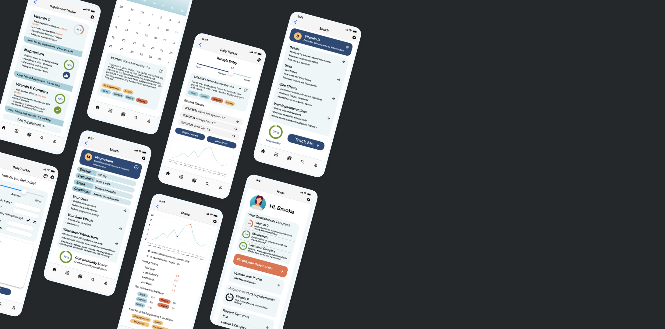
My final design reflected the needs of my users by allowing for quick research of supplements, personalized advice based on their health profile, and easy-to-understand insights on how a supplement was working for them. This design helped users quickly understand if a supplement was working for them or not, and what to do about it. It also made it easy to track unrelated symptoms and quickly learn about new supplements that may benefit them.
Future iterations of this design will focus more on the goals and needs of the second target audience, which is patients and practitioners at integrative wellness facilities. Due to the time constraints of the project, I only focused on features that solved the problem statement.


