Customer Onboarding Initiative
An initiative to design guided wizards for first-time platform users, allowing users to request products, explore the platform, join a community, submit a user intake request, or figure out what kind of products are right for them.
-
This project was created with new users in mind. Users of this platform (“Platform X”) were struggling with how to navigate Platform X’s website, find the information they needed, and request access to tools or products. The goal of this project was to create an all-inclusive set of guided wizards for users when they first access the website. This way, users would feel they knew how to navigate efficiently on the platform and have their specific needs met within the first five minutes of landing on the homepage. After research, it was decided the starting guided wizard would give five main options to new users, with each option containing its own wizard for each user need.
This project took place in 2021 and lasted approximately 3 months.
-
This is a large design project. Unfortunately, this project is confidential. However, the client was a large data platform that operates for the Department of Defense. Due to the confidentiality of this project, any prototypes shown will have been altered to remove information. This also means I may be a little vague at times - I apologize in advance.
-
My role is the lead designer for the project. While I report to a creative team lead, I am the one designing each wizard, reporting to my client, making changes, and consulting with developers.
For this project, I used Adobe XD as my design tool. Jira and Confluence are being used as agile tools to keep the project on pace.
While I am part of other research efforts with this client, I was not involved in the research aspect of this project.
-
The large challenge of this project is to create wizards that will actually solve the problems that first-time users have when visiting the platform. Previous research had determined that the main issues users had when first visiting the platform included: not knowing where to look, an easy way to request products, not knowing what products were available (or they needed for their work), how to get access to a community space, and how to submit a user intake request.
Each issue needed its own personalized wizard designed specifically for those users’ needs. For example - those looking for an easy way to request products already knew what they were looking for, while others had no idea what the platform offered or if the tools available would actually help them with their work.
Each user flow not only had to be easy to follow but also short (under five clicks) and successfully solve the user’s problem. An additional challenge was keeping the users engaged and pushing them towards additional content on the platform.
-
The creation of the guided wizard paths was a part of an ongoing effort to improve customer onboarding on the platform. The work was tracked via Jira. The effort had one large Epic broken up into a plethora of tickets.
The first design in the design process was designing the initial welcome screens that all users see when they first enter the website. The initial screen covered filling in or approving profile information, while the second gave users five different options for onboarding, depending on the reason they came to the platform. The rest of the wizards were completed most important to least important. They were reviewed and discussed during tri-weekly scrum sessions, each going through 2-3 iterations before final approval.
-
Since each guided wizard had its own challenges, they all needed separate solutions. However, every wizard was consistent in terms of design, language, and length. The platform’s brand colors were utilized, as well as platform imagery, personas, and standard UI elements.
Wizard 1: The ‘Getting-Started’ Guided Wizard
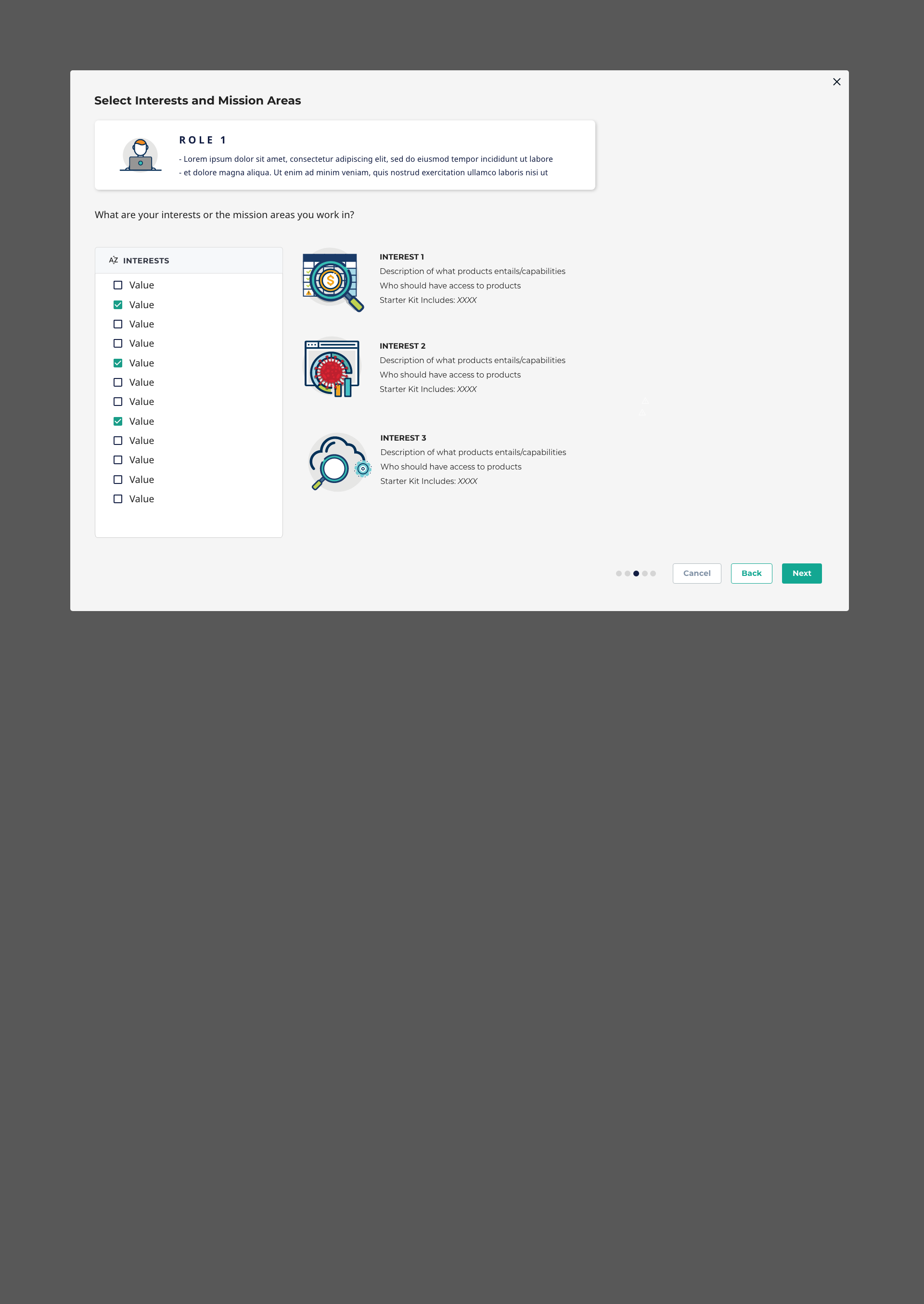
This wizard was created for the user who had no idea what kind of products they wanted or needed. The first goal of the wizard was to determine their user persona: two overarching archetypes were displayed with information about each one, with information about each archetype below. Example personas were listed as well. Once a user chose an archetype, it would split into two separate paths. Both paths asked for their interests, gave them some basic information about the products in that category, and then granted the user access to some starter tools in those categories. Those who picked the second archetype were directed at the end to another location, as they needed to get specialized access to some tools.
Wizard 2: Choosing your Own Products
This one is pretty self-explanatory - it gave users the option to search for the product they were looking for as well as filter by interest group. Users were able to request access to any kind of product they wanted with no restrictions. If additional steps were needed in order to grant them access, the users were notified and told how to complete those steps.
Wizard 3: Explore and Discover
This wizard gave users a walk-through of what the platform had to offer and how to navigate the website. Afterward, it pointed them in the direction of their user profile or how to request access to products.
Wizard 4: Joining a Community
The platform offered various community spaces for groups of users who had similar goals and needed specialized products. This wizard gave them background information on each community and allowed them to request access. It would then show them how to request access to community-specific tools.
Wizard 5: Submitting a New Use Case
This wizard was the most challenging, as the use case intake team made it clear that the vast majoroity of users who submitting use cases did not understand the requirements. This created an abundance of use cases that had to be dealt with - most of them leading to nothing, as they didn’t fit with the plaftorm’s missions or the platform could not offer them. Some users submitted use cases for products and capabilities that already existed, and others thought it was similar to a help desk ticket. The goal of this wizard was to make sure that users had done all the necessary steps before they submitted a use case intake form. Because most of the steps could not be done immediately, the wizard focused on what to do first, gave resources as well as a downloaded resource for users to look back on. At the end, it would lead them to where they could submit a use case intake form.
-
These designs are still in the process of being added to the platform and have not gone live. The next steps include collaborating with developers to ensure a successful roll-out as well as conducting user tests with the beta designs. After user testing, the wizards will likely go through more edits before going live on the platform.
Want to See the Prototypes in Action?
Iteration 2 Designs
Guided Products Screen 1
Guided Products Screen 2
Guided Products Screen 3
Guided Products Screen 4
Guided Products Screen 5
Choose Products Screen 1
Choose Products Screen 2
Choose Products Screen 3
Choose Products Screen 4
Choose Products Screen 4
Iteration 3 Designs
Choose Products 1
Choose Products 2
Choose Products 3 - Filtered
Choose Products 4
Choose Products 5
Choose Products 6
Choose Products 1 - List Version
Choose Products 2 - List Version
Starting Screen
Role 2 Path
Role 1 - Interests
Recomendations
Role 1 - Last Screen
Role 1 Path
Role 2 - Interests
Role 2 - Final Screen
RELATED PROJECT:
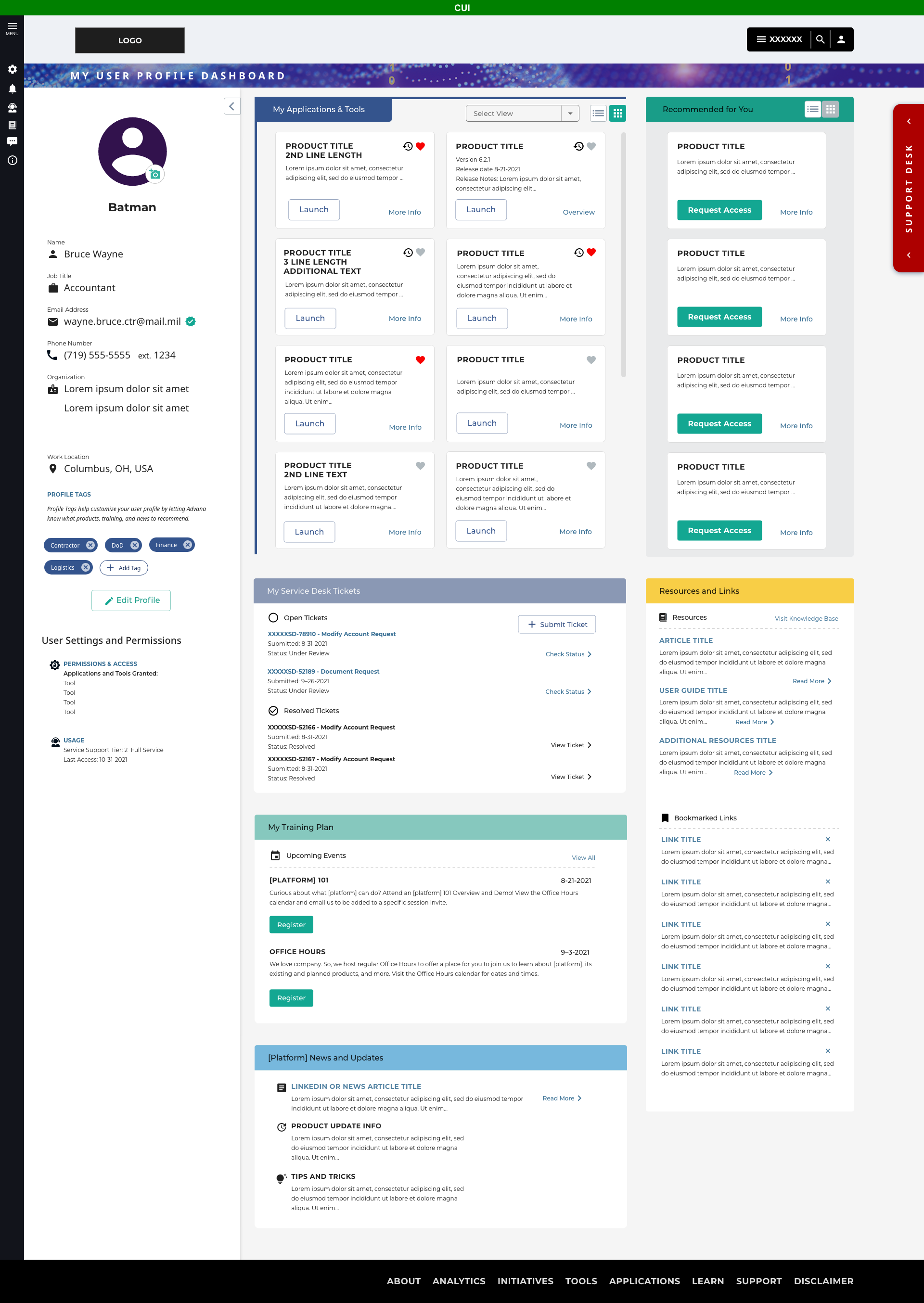
User Profile Dashboard
User Profile Dashboard
Adding Profile Tags 1
Adding Profile Tags 2
Updating Profile Info


